

Our resident graphic design pro, Kori, is here to share her Favorite Fonts for 2014! enjoy! -Linda
I don’t know about all of you, but a new year makes me completely giddy….like a kid the day before their birthday! There are possibilities and opportunities ahead…there is the chance to rethink, plan, and find ways to make the coming year even BETTER than the one that passed! While I don’t make “resolutions” (because I don’t do well at “keeping” them), I DO sit back and think about my business and designs and a general direction I want to move with it! I think about designs and how I should change certain things, do more of other things, and less of some things. I also love to look at design inspirations and trends that have been forming and what I would love to see more of! This brings us to the font talk!
Here are my personal thoughts for some great fonts you should add to your font book this year (if you don’t have them already!). Below the fonts, I have links to each, price where applicable, and why I think you should add them to your font collection for 2014!


Favorite Fonts for 2014
1) Futura – This font was originally designed in 1927 geometric sans-serif based on strokes of near-even weight, which are low in contrast. I love it’s no nonsense personality and think it’s a great font to use in combo with almost any other font. If it’s been popular since the commercial release in the 1930s, I think it’s safe to say it can hold it’s own in 2014! Starting at around $29
2) Peoni Pro – So, I won’t lie…I have a thing for Emily Lime fonts as you will see in this post. Peoni Pro is quirky, cute, and has a pretty authentic “custom hand lettered” feel to it! There are a ton of glyphs, alternate, swashes, and more!! This font starts at $89 but if it’s well worth it if you are a font lover!
3) Walkway – A free one for you!!! One of the main reasons I love this free san serif is that there are so many options without having to adjust spacing, kerning, or even weight. This font has so many options, that you just choose the one that works best with your design and go!
4) Bombshell – Oh I just adore this font! I have used it so many times and I always love how it flows! It’s another font from Emily Lime and this hand-calligraphy font is full of options, glyphs, alternates, and LONG connections to help you create a realistic calligraphy look! Starting at $54, this font will be used enough times to pay for itself!
5) YWFT Hannah – This font is on sale right now, starting at only $10! There are three versions of this font that don’t produce variation and contrast between weights like the average font, but between widths! I personally love mixing the widths within the same word as shown in the above example (notice one N is skinny while the other is medium…same for the Hs…while the W is wide!) This popular handset design has been featured on various sites since it’s release and will keep going for a fun and unique font in 2014!
6) Emily Lime – The namesake of Emily Lime Design… I only wish my hand-writting looked just like this! Perhaps I will just pretend it’s my writing…just don’t tell, ok? This was the first design from Emily Conners, and a fun, fully connected script that’s easy to use in a variety of ways!! It starts at $29
7) Champagne & Limousines – I mean, it’s new years after all…I couldn’t help but add Champagne & Limousines to the mix for a New Year’s Party!! This is one of my basic “wing-man” san serifs …I tend to use this when nothing else quite works…an easy to use font that plays well with others, it reminds me a bit of Century Gothic, but has a unique spin that gives it it’s own personality! Oh…and it’s FREE for personal use!
I hope this helps you start 2014 well designed!! Happiest of Holidays to you all!
Kori
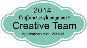
Want to be a part of Craftaholics Anonymous®? Apply for the 2014 Creative Team here!
Kori
Latest posts by Kori (see all)
- Free Spring Printable – Smile It’s Spring - Mar 20 2014
- I’m so Crafty I Sweat GLITTER! Free Printable - Feb 18 2014
- Favorite Fonts for 2014 - Dec 30 2013
I have a weird love for fonts. These are pretty great. Thanks for sharing them!